Original source of the infographic
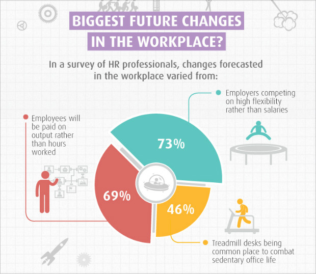
This graphic shows the three biggest future changes in the workplace according to a survey conducted by Human Resources professionals.
The three aspects in this pie chart cannot add up to 100 percent.
Also, the graphics does not show what the percentage means. Is it the proportion of people who agree with the following statement?
For pie charts, the essence lies in showing the proportion of different parts of a whole. But for this case, the percentage does not mean anything but the number of people.
From my point of view, a bar chart is better in illustrating the content instead of the pie chart. We can also list the three aspect from the high support rate to low support rate.